Personally designed signs for schools
Don't just signpost your school - show it off in style with inspirational design...
Wall Signs
Printed in HD on 3mm aluminium, with a scratch resistant protective varnish, these signs were also laser cut. This enabled the characters to 'come to life' and reach beyond the borders of the artwork to help reinforce the school brand. Chrome screw cap embellishments also help to promote the quality and attention to detail of the project.
It was an exciting time for Seymour Park Community Primary and Stellar School Signs as design mock ups began to take shape from an initial meeting. The first step was to refine the school logo and digitally re-draw it. This helped not only to establish a consistent brand image which could be used across all platforms, but also to create a usable, high quality, lossless format - essential for taking a 3cm drawing to impressive 300cm-wide HD printed signs.
Case Study
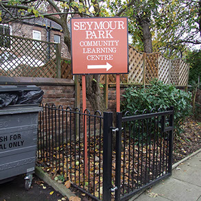
Seymour Park Community Primary School
Old Trafford, Manchester
Seymour Sees More…
Inspired by some of Stellar School Signs' examples which broke the mould of the run-of-the-mill, dome-topped, text-heavy signs seemingly plaguing the country, Headteacher Anthony Rae took the plunge and made the call.
Like many primary schools, their logo was derived from a child's drawing and is used in various capacities across the school - school jumpers, wall graphics in a couple of learning rooms, reception TV… but nothing quite on such a site-wide grand scale.
Stop being such a square!
The main design criterion for this project was to bring things to life and add a little excitement. Headteacher Anthony Rae decided that the current signage didn't really reflect the spirit of the school and was long overdue an update. Already judged by Ofsted as an Outstanding school, he was keen to continue to develop and improve all aspects of the school. Though he doesn't see 'pleasing Ofsted' as the main reason for the revamp - the refresh is more of a way to enhance the school ethos and to continue to motivate and inspire at a whole school level. As a visitor, it was immediately clear that there was a positive air of enthusiasm amongst staff and pupils, and bringing the school image up-to-date, and in line with the spirit of this community, was clearly going to be both a necessary and exciting task.
Stellar School Signs visits many schools that use many different types of signs and graphics as a source of inspiration or a catalyst to reinforce positive aspects of the school - an obvious and effective strategy to reinforce school values and motivate staff and pupils. But there was something about Seymour Park that demanded a design process to be ignited with the creativity dial set to maximum. The Headteacher was thinking outside the box, and we liked it! We also hate that cliché, but perhaps you'll agree that in this case 'outside the box' is very much appropriate.
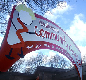
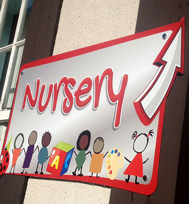
From giant internal Wordles, along with 30 internal Language-for-Learning signs around the school, to entrance archways and finger posts... the school 'brand', along with the messages behind it had to be able to reach new heights - quite literally!
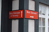
Old signs above: Signs don't just have to be directional or informative.
New signs below: Technology has moved on - we're no longer restricted to square shapes and single colour vinyl letters. Full colour HD printing and laser cutting clear the way for creative thinking and inspiring artwork.
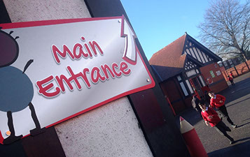
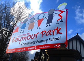
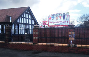
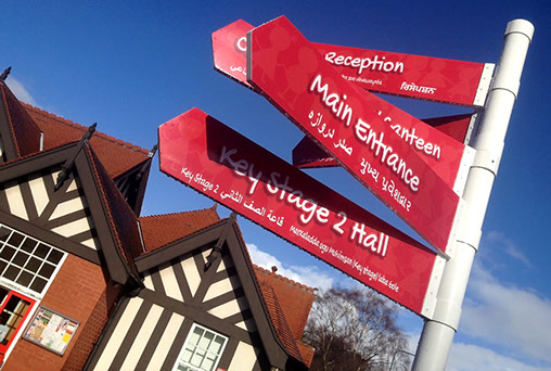
Main Signs
Full Colour, high resolution, laser-cut aluminium signs were installed in all the main entrances. Whilst there is no restriction on size, these signs were made as single pieces up to 3m wide.
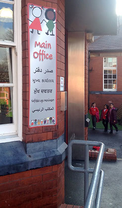
Finger Post
A cost-effective aluminium finger post now greets visitors at the main entrance. Full colour HD printing enables design enhancements (such as shading, shadows, image background effect) over traditional single colour vinyl letter-only signs. In addition, translations were incorporated for Urdu, Punjabi, Somali, Arabic and Gujarati.
Language for Learning
With a spectacular glittery, frosted effect backing, 30 of these wonderful language plaques were placed at key places throughout the school. They featured different key language-for-learning words exclusive and relevant to the school, with each plaque featuring different characters from the school logo reinforcing the school identity.

A4 perspex with chrome stand-off locators.
Feeling inspired? Contact Us!
We'd love to hear about your project and offer some advice, quotes, and even some no-obligation design mock-ups...
Click the button below
CLICK HERE
or Click HERE to go to our
main website page
You'll find prices and product specifications of some of our most popular products. However, this only scratches the surface of what we are able to produce! Please contact us for a bespoke quote.
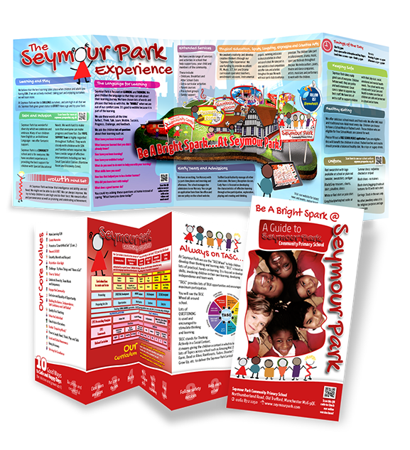
New School Guide
Headteacher Tony Rae wanted something a little different for highlighting what would traditionally be presented as a school prospectus. The new guide helps to focus on the 'experience' of learning at Seymour Park. QR codes also divert mobile devices to an online version which also contains rich media such as videos with more information regarding items such as school uniform, the language of learning and SEN and inclusion policies and insights.
Watch this space for our brand new prospectus design website!
Lightweight Foam PVC materials offer maximum value for money and look incredibly impressive at large sizes. The main wordle stands a proud 3m x 2m, centre stage on the school canteen back wall.
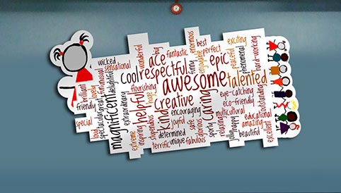

Giant Wordles
School Canteen Worlde measuring 3m x 2m
'Branding' in schools
A short article by Simon Tebbenham
Stellar School Signs' Designer of Seymour Park Community School signage project
Many people associate the word 'brand' with a logo, advert, slogan or marketing.
And that's not what it's all about. A brand is intangible - it's about making an emotional connection.
A brand, developed by the power of consistent presentation, should assist in reflecting the values and beliefs of your school. And this isn't as daunting or difficult to achieve as some might imagine. The word brand can be a scary word for any business, perhaps more so for schools. It's sometimes useful, therefore, to simply swap the word brand for something more familiar like 'ethos'.
A strong, positive school ethos (or brand) will be reflected in the attitude and performance of your pupils and staff. So when we talk about brand-ING, what we really mean is simply MANAGING THE SIGNALS TO EVOKE POSITIVE INTERACTIONS. Teachers do this in many ways every day which is a major contribution to a brand. Signs and visual artwork stimuli are also a major contributor to the ethos of a school. If you consider a brand to relate to ethos, then a school's appearance, along with its influence and interactions, is a pretty large piece of the pie to get right.
And it's all about CONSISTENCY… The 'C' word is floating about everywhere in a school - consistency in discipline, rewards, procedures, marking and assessment, language... and so on. But what about consistency of presentation? Consistency of how school values and ethos are delivered? A consistency of attitudes and aspirations? How could a school expect consistency from learners if the school itself is inconsistent in its messages?
And your school's messages are EVERYWHERE...
On a handwritten notice pinned to a store cupboard, an A4 handout in the ubiquitous Comic Sans, a newsletter, report card, display wall, worksheet, Powerpoint presentation, computer desktop background - even the school's main sign... the opportunity for INCONSISTENT messages is huge.
Inconsistency across presentation within a school sends messages of being disjointed, unreliable, uncommitted and unfocussed. These messages are inadvertently absorbed by staff and students, and subsequently this is reflected in their performance and productivity. BUT if your school's messages are presented in a strong and consistent manner, you are sending out positive signals about your school's attitudes, standards, attention to detail and reliability. And in turn, these attributes become instilled in your staff and pupils. A consistent brand identity is a highly effective - if not essential - way to communicate your school's values and aspirations.
Not everyone needs a complete makeover. On the contrary, rarely is this actually necessary. I see lots of schools that have spent five or six times our average sales price on over-elaborate makeovers that are only skin deep. If your school's ethos is sound, and you accept that branding is nothing more than a vehicle to consistently reinforce those core values, then the process actually becomes very simple. It doesn't have to be complicated. It doesn't have to be expensive. But it needs to inspire, and it needs to be consistent - whatever your budget, whatever the scale. It's that simple!
Simon runs a visiting CPD for Headteachers and SLT 'Create A School Ethos For Excellence Through Branding' - for more info, please visit www.ethos123.co.uk
PAGE 1
PAGE 2
We'd love to hear about your project and offer some advice, quotes, and even some no-obligation design mock-ups...
CLICK HERE
Tell us about your project...
We Offer Fully Bespoke Designs - Please Contact us for any Special Requests and Quotes info@stellarschoolsigns.co.uk Tel 020 3287 3107.